
Reading a Relative Rotation Graph, and the Window It Hides

A relative rotation graph puts a whole list of securities on one chart and asks a single question of each: how is it doing against a chosen benchmark, and is that comparison getting better or worse. The answer is a dot, and the dots drift.
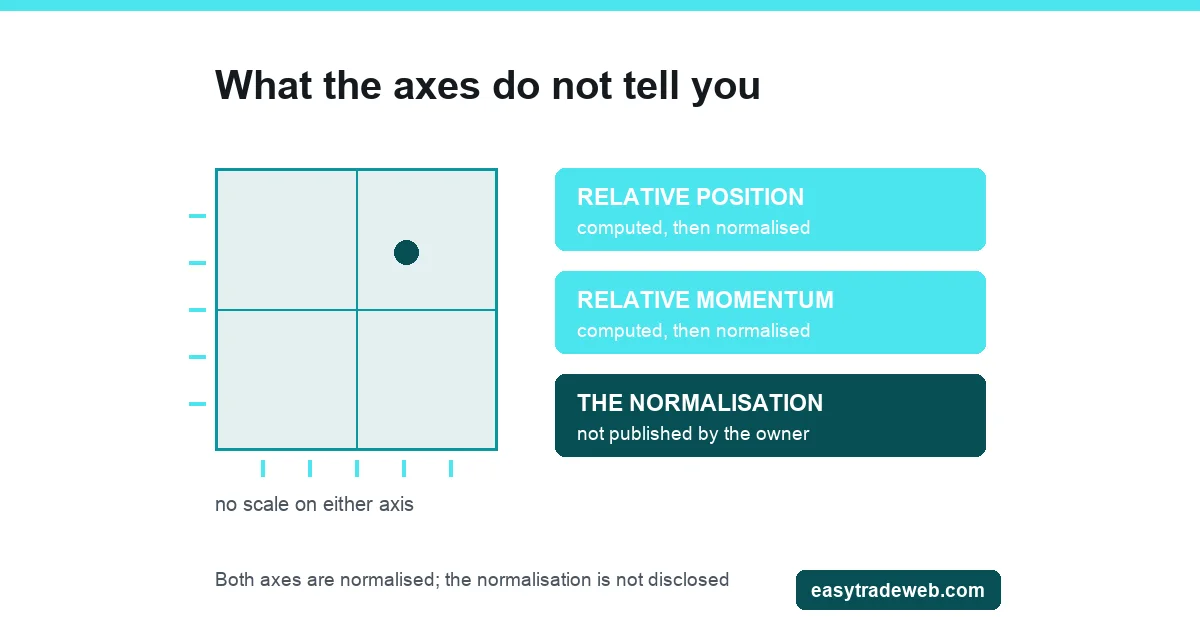
Most explanations stop at naming the four quadrants. Three things then go unsaid. The first is that the benchmark is a choice, and the choice decides where everything lands. The second is that the numbers behind the two axes are not published, so nothing on the chart can be checked by hand. The third is that the trail behind each dot is drawn from an observation window nobody states.
This page covers those three, and whether a list of currency pairs can sit on such a chart at all, which the general explanations of how asset classes move against each other do not reach.
Key takeaways
- Both axes are relative. Nothing on the chart says whether a security rose or fell, only how it did against the benchmark and whether that comparison is speeding up or slowing down.
- RRG Research states that the graph is a visualization rather than a trading system, and that no track record is defined for it.
- Changing the benchmark reassigns every dot. Two charts of the same securities on the same dates can disagree completely and both be correct.
- The calculation behind the two axes is not published by the company that owns the method, so the values cannot be recomputed by hand or compared across vendors.
- The tail is a run of past readings, and its length and smoothing are settings rather than properties of the security.
Table of contents
- What the Two Axes Are Measuring
- The Benchmark Decides Everything Before the Chart Does
- Whether a Currency Universe Can Sit on One
- What the Tail Is, and the Window It Does Not Show
- Why the Numbers Cannot Be Recomputed
- What a Rotation Map Is Not
- Questions Readers Ask About Relative Rotation Graphs
- Which Reading Applies to Your Chart
What the Two Axes Are Measuring
Two numbers are computed for every security in the list, and both are comparisons rather than prices.
The horizontal axis holds the relative position: how the security has performed against the benchmark over the recent past. Right of centre means it has been outperforming. Left of centre means it has been lagging. The vertical axis holds the rate of change of that same comparison. Above centre means the outperformance is building, or the underperformance is easing. Below centre means the reverse.
The consequence is worth stating plainly, because it is the most common misreading. A security can sit in the upper right while its own price is falling, if the benchmark is falling faster. A security can sit in the lower left during a strong rally of its own, if the benchmark rallied harder. Nothing on this chart reports direction.
It reports a ratio and the slope of that ratio, which is a different object from the price series a candlestick or a line draws, and worth holding against how a chart type changes what you see.
Combine the two axes and four regions appear. Ahead of the benchmark and still improving. Ahead of it but losing that edge. Behind it and still deteriorating. Behind it but recovering. The platform labels differ slightly by vendor, and the idealised path through them is a clockwise loop, which is the rotation the name refers to. Whether any given dot follows that loop is an observation about that dot, not a rule the chart enforces.
The Benchmark Decides Everything Before the Chart Does
Every value on the graph is a comparison, and a comparison needs a second term. That second term is supplied by whoever set the chart up, and it is not a technical detail that can be left on a default.
Consider a list of ten securities plotted against a broad index, then plotted again against one of the ten. The underlying price data has not moved. The dots will occupy different quadrants, the tails will point in different directions, and any conclusion drawn from the first chart may be reversed on the second. Both charts are arithmetically correct. They answer different questions, because the question was set by the benchmark and not by the securities.
This matters more than it first appears, because a benchmark is rarely neutral. A cap-weighted index is dominated by its largest members, so plotting those members against it partly measures each one against itself. An equal-weighted benchmark removes that effect and introduces another, since it gives a small constituent the same voice as a large one. A benchmark drawn from a different market again imports whatever is happening in that market into every reading on the chart.
So the first question to ask of any rotation graph is not which quadrant a name sits in. It is what the dots are being measured against, and whether that choice matches the decision being made. A chart built to compare sector exposures inside one index answers nothing about whether that index is worth holding. The method that acts on that comparison rather than merely reading it is a sector rotation strategy.
Whether a Currency Universe Can Sit on One
The method is not restricted to equities. RRG Research, the company behind the graphs, states that the technique began with sector rotation and is now applied to universes across asset classes, and lists bonds and currencies among them alongside stock indexes, individual stocks and asset allocation. So the short answer is that a currency universe is within the intended use.
The long answer is where the difficulty sits, and it is a difficulty currencies have that sectors do not. A currency pair is already a ratio. EUR/USD is the euro measured in dollars, not the price of a single thing. Putting pairs into a rotation universe therefore means measuring a ratio against another ratio, and the result depends entirely on what the denominator of the second one is.
Three benchmark choices are common, and each produces a different chart. Measuring a set of pairs that all share a quote currency against a basket of that currency answers whether each base currency is beating the average. Using a basket measured against one currency imports the fixed weights of that basket into every reading, so a heavily weighted component is partly being compared with itself.
Building an equal-weighted benchmark from the universe removes that distortion and makes the chart entirely self-referential: every dot is measured against the average of the dots, so half the list is above the line by construction.
None of the three is wrong. What matters is that the benchmark is stated, because a currency rotation chart with an unnamed benchmark carries no information. A rotation reading is also not a participation reading: how many members of a market are moving together belongs with measuring participation rather than price, which has its own reasons for not transferring to a pair.
What the Tail Is, and the Window It Does Not Show
Each dot trails a short line behind it. That line is not decoration and it is not a forecast. It is the same two coordinates plotted for the preceding periods, joined in order, so the reader can see where the security has come from rather than only where it is.
A long tail curving through the upper right and into the lower right says the outperformance has been in place for a while and is now flattening. A short tail crossing the centre says the comparison has only just changed sign. A tail that doubles back on itself says the reading has been unstable, which is information about the reliability of the current position rather than about the security.
What the tail does not show is the window it was drawn from. The length of the tail in periods, the timeframe of each period, and any smoothing applied are settings on the chart rather than facts about the security. Change the timeframe from daily to weekly and the same name can sit in a different quadrant on the same date. Shorten the window and the tail becomes noisier and the crossings more frequent. Lengthen it and the dot arrives late.
This is the ordinary trade-off of any smoothed measure, and it is not a defect. It becomes a problem only when a quadrant is quoted without the window it was read at, or when a chart is read as though the quadrant were a property of the security. It is a property of the security, the benchmark, the timeframe and the window, taken together. Two analysts can look at the same universe on the same day, disagree about which name is leading, and neither be mistaken.
Why the Numbers Cannot Be Recomputed
The two axis values are normalised before they are plotted, so that securities with very different volatilities can share a scale. The normalisation is the part that is not in the public domain.
The name of the method, and the names of the two axes, carry a registered trademark.
The graphs are supplied through licensed partner platforms rather than as an open calculation, and the site of the company that owns the method sets out what the graph shows and where it can be obtained without setting out how the coordinates are produced. Its home page, its answers to common questions and its blog index were read on 20 August 2026, and none states the calculation, the centre value of the scale or the smoothing applied.
Three practical consequences follow, and they are the reason this section exists rather than a complaint about disclosure.
The values cannot be checked by hand, so an unexpected reading cannot be traced to an input.
Readings cannot be compared across vendors, because two platforms may implement the published description differently and there is no reference implementation to test either against. And any figure quoted for a coordinate is only meaningful with the platform, the benchmark, the timeframe and the window all named beside it. A number lifted from a rotation graph and repeated without those four is not a measurement, which is why no coordinate values appear anywhere on this page.
What a Rotation Map Is Not
RRG Research states directly that the graph is a visualization tool rather than a trading system with rules, and that no track record is defined for it. That statement comes from the party with the strongest commercial reason to claim otherwise, which is what makes it worth repeating here.
It is not a signal generator. A dot entering a quadrant is a description of a ratio that has changed sign, not an instruction, and nothing about the crossing says anything about position size, risk or the price at which an order would fill.
It is not a measure of value or of health. A name can lead the chart through an entire decline because the benchmark declined further, and it can lag through a rise for the same reason inverted.
It is not a cycle model. The clockwise loop is a tendency observed in the plotted coordinates, not a schedule, and it says nothing about where the economy sits in its cycle. Dots reverse mid-quadrant, sit still, and cross back the way they came.
| Question a reader brings | What the chart answers | What it cannot answer |
|---|---|---|
| Is this security rising? | How it compares with the benchmark | Direction of its own price |
| Which name is strongest? | Which is furthest ahead of this benchmark | Anything under a different benchmark |
| Has the trend turned? | Whether the ratio has changed slope | Whether the turn survives the next period |
| Can I check this number? | Nothing, on its own terms | The calculation is not published |
Questions Readers Ask About Relative Rotation Graphs
What is a relative rotation graph?
A chart that plots a list of securities by two comparisons with a chosen benchmark: how each one has performed against it, and whether that comparison is improving or deteriorating. Every value on it is relative, so no point on the chart reports the direction of a price.
What do the four quadrants of an RRG mean?
They are the four combinations of the two axes. Ahead of the benchmark and still improving, ahead of it but losing ground, behind it and still weakening, and behind it but recovering. The idealised path through the four is a clockwise loop, which is where the word rotation comes from, and an individual security is under no obligation to follow it.
Can a relative rotation graph be used for forex pairs?
Yes, and the company behind the method lists currencies among the asset classes the technique is applied to. The complication is that a currency pair is already a ratio of two currencies, so a universe of pairs has to be measured against a benchmark that is itself chosen: a basket, a shared quote currency, or an average of the universe. Which one is used decides which quadrant each pair falls into.
What does the tail on an RRG show?
The same two coordinates plotted for the preceding periods and joined in order, so the path into the current position is visible. How many periods it covers, the length of each period and any smoothing applied are settings rather than fixed properties, and changing them can move a security into a different quadrant on the same date.
Is an RRG a trading system?
RRG Research states that it is primarily a visualization tool rather than a trading system with rules, and that no track record is defined for it. A dot crossing between quadrants describes a change in a ratio. It carries no entry price, no exit, no position size and no risk limit.
Which Reading Applies to Your Chart
Before drawing any conclusion from a rotation graph, settle four things about the chart in front of you rather than about the securities on it.
If the benchmark is not named, the quadrants mean nothing yet and that is the question to answer first. If the benchmark contains the securities being plotted, the reading is partly circular and the largest members are the most affected.
If the timeframe or tail length has been changed from the platform default, treat a quadrant crossing as provisional until it holds over more than one period. And on a currency universe the benchmark choice is the whole reading, so a chart that does not state it is not yet usable.
Risk warning: this page is educational and describes what a chart type measures and what it does not. It is not advice to trade, not a recommendation of any platform, vendor or instrument, and not a suggestion that any quadrant position is a reason to buy or sell anything. Leveraged trading carries a high risk of loss.