
Ascending Triangle Pattern: How Flat the Flat Side Has to Be

An ascending triangle is drawn with two lines: a flat one across a set of highs and a rising one under a set of lows. Almost every description of it uses the word horizontal for the upper line and then moves on, which leaves the reader holding the one decision that actually matters.
Real highs are never identical. They sit within a few points of each other, and nothing published says how far apart they may drift before the line stops counting as flat. That single unstated tolerance decides whether the shape in front of a reader is an ascending triangle, a rising wedge, or nothing worth naming.
What follows works through which of the two lines carries the meaning, how the flat side is judged when no source defines it, the one test that separates the pattern from a rising wedge, what the circulated win rates were measured on, whether the bullish label survives context, and how the shape is drawn on a platform whose triangle tool cannot do the job.
Key takeaways
- No standards body, exchange or platform vendor publishes a tolerance for how flat the upper line must be. The word horizontal is used as though it were exact, and it is a judgement.
- The test that separates an ascending triangle from a rising wedge is whether the upper line rises at all. If both boundaries rise, the shape is not an ascending triangle however the lows behave.
- Those two facts are the same fact. Because flat has no published cut-off, a shallow rise in the upper line is exactly where the two shapes stop being distinguishable, and a pattern sitting there is better left unclassified than forced into a label.
- The win rates circulated for this pattern are computed on equity datasets. A spot currency feed has no consolidated tape and no closing auction, and MetaTrader fills its volume column there by counting quote movements rather than contracts.
- The MetaTrader 5 triangle object is closed and pinned at three anchors. The pattern instead needs two boundaries that carry on past the bars that formed them, which is a setting on the trend line object rather than on the shape.
Table of contents
- The Two Lines, and Which One Does the Work
- How Flat the Flat Side Has to Be
- The One Test That Separates It From a Rising Wedge
- What the Published Win Rates Were Measured On
- Bullish by Definition, or Bullish by Context
- Drawing It With Two Rays, Not the Triangle Object
- What to Check Before Treating One as Real
The Two Lines, and Which One Does the Work
The rising lower line is the one that gets described as the story. Each low sits above the last, so the distance between the two boundaries narrows, and the shape is read as buyers paying up while sellers hold a fixed price.
That reading is fine as far as it goes, but the lower line is not what makes the pattern this pattern. A rising lower boundary appears in a rising wedge, in a channel and in an ordinary uptrend. It carries no identifying information on its own.
The upper line does all of the identifying work. It is the flat one, and flatness is the only property in the definition that is unusual enough to distinguish the shape from anything else with an upward slope. Everything a reader concludes from the label therefore depends on a judgement about that line.
Which is why the drawing method has to be settled before the label is applied. Two points fix a line and a third tells you whether the first two meant anything, and the question of how many touches a boundary needs before it is a boundary is the same question that governs a channel. It is worked through in detail in how many points define a channel, and the answer there applies unchanged here.
How Flat the Flat Side Has to Be
Search the definitions and the tolerance is never stated. The upper boundary is called horizontal, flat, or a level of resistance, and the reader is left to decide what counts. No exchange, no standards body and no platform vendor publishes a threshold, because chart patterns are descriptive conventions rather than specified objects.
The practical problem is that highs in a real market are never equal. Three highs within a handful of points of one another look flat on a compressed chart and look like a gentle slope when the same bars are stretched. The chart settings change the appearance of the line without changing a single price.
So the comparison a reader needs is not visual. It is between the spread of the touch highs and the size of a normal bar on that instrument and timeframe.
If the highest and the lowest of the highs that define the line sit within a small part of a typical bar range, treating the line as flat costs nothing. If the spread across them approaches a full bar range, the line is a shallow trend line and the shape is something other than an ascending triangle.
What no source supplies is the number where one becomes the other, and inventing one here would be worth less than saying plainly that it does not exist. The honest handling is that a pattern near that boundary is unclassified rather than borderline, and an unclassified shape carries none of the expectations the label was supposed to justify.
A second decision sits underneath this one and is often confused with it. Drawing the line to the extreme of each wick and drawing it to the highest close produce two different lines from one chart, and a line that is flat under one rule can slope under the other. That decision, and what it does to the level a reader ends up acting on, belongs to drawing a trend line and is treated there rather than repeated here.
The One Test That Separates It From a Rising Wedge
The two shapes are confused constantly, and the confusion is understandable, because both narrow and both have a rising lower boundary. Readers looking for the difference are usually offered a description of each in turn and left to compare.
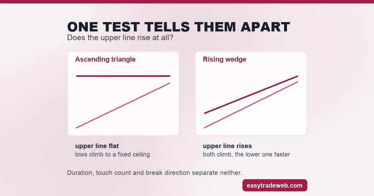
One question settles it. Does the upper line rise at all? In an ascending triangle it does not, and the convergence comes entirely from the lows climbing toward a fixed ceiling. In a rising wedge both boundaries rise and the convergence comes from the lower one rising faster than the upper.
Everything else people reach for is unreliable. Duration does not separate them, neither does the number of touches, and neither does the direction of the eventual break. Only the slope of the upper boundary is definitional, and it is a single thing to look at.
| Property | Ascending triangle | Rising wedge |
|---|---|---|
| Upper boundary | Flat | Rising |
| Lower boundary | Rising | Rising, more steeply than the upper |
| Source of the narrowing | Lows climbing to a fixed ceiling | Both lines climbing at different rates |
| What decides the label | Slope of the upper line only | Slope of the upper line only |
| Where the two become indistinguishable | A shallow rise in the upper line, with no published cut-off either way | A shallow rise in the upper line, with no published cut-off either way |
The last row is the part that matters and the part usually left out. A single test is only decisive where the input is clear, and the flat side has no defined tolerance, so the test inherits that vagueness exactly at the boundary between the two shapes.
The classification is reliable in the obvious cases and undefined in the close ones, which is a property of the convention rather than a failure of the reader. The wider family, and how a rising wedge behaves in its own right, is set out separately.
What the Published Win Rates Were Measured On
Percentages attached to this pattern circulate widely, and they are quoted without the one piece of information that would make them usable, which is the population they were computed over. Figures of that kind are not restated on this page, because none of them traces to a source that publishes its method.
What can be established is what such datasets are built from. Pattern statistics of this type are compiled from listed equities, where every trade prints to a consolidated tape, sessions open and close at fixed times, and a closing auction sets a single reference price. Those three features are what makes a clean historical sample possible in the first place.
A spot currency market has none of them. It is decentralised, so no complete record of traded size exists to compile from, and the quotes a reader sees come from the particular set of counterparties a broker aggregates. Two brokers can print different highs for the same hour, which means the touch points defining the flat line are themselves broker-specific.
The volume column does not transfer either. MetaTrader 5 documentation splits the two cases apart: on a forex symbol the Volumes indicator counts how often the quote moved during the bar, and on a stock symbol it reports quantity that genuinely changed hands, measured in contracts, money or units.
A count of quote updates and a count of contracts are different quantities, and any confirmation rule written for one is not measuring the same thing on the other. What that does to volume confirmation on a spot feed is worked through in what happens to volume confirmation on a spot feed, which also examines what published pattern parameters rest on when no source is given.
Bullish by Definition, or Bullish by Context
The pattern is filed almost everywhere as a bullish continuation pattern. Both halves of that phrase deserve a moment, because the second one is doing work the first one gets credit for.
Continuation is a claim about what came before. A shape can only continue a move that already existed, so the label presupposes a prior advance into the pattern. Where there is no prior advance, the same geometry is not continuing anything, and calling it a continuation pattern describes the drawing rather than the market.
Bullish is then a claim about what follows, and it is inherited from the continuation reading rather than established independently. The flat ceiling and rising floor are a description of recent behaviour between two boundaries. They are not evidence about the next move on their own.
The useful version of the label is conditional. If a clear advance preceded the shape, the continuation reading has something to continue and the bullish description means something. If it did not, the geometry is the same and the expectation attached to it is not.
Drawing It With Two Rays, Not the Triangle Object
MetaTrader 5 ships a triangle among its shape objects, and it is the wrong tool for this. Its shapes documentation requires three anchors to place one, so what appears on the chart is a closed three-cornered outline pinned at those corners.
The pattern needs something a closed figure cannot give. Both boundaries have to continue forward past the last bar that touched them, because the entire purpose of drawing them is to see where price meets them next. A shape that terminates at its third corner stops exactly where the useful part begins.
The trend line object is what does this. It is anchored by two points, and the MQL5 object reference documents a pair of ray settings on it, OBJPROP_RAY_RIGHT and OBJPROP_RAY_LEFT, which govern whether the drawn line carries on past its anchors toward each edge of the chart.
Switching the right-hand one on turns a segment between two highs into a level that keeps going. Two such objects, one across the highs and one under the lows, give a flat boundary and a rising boundary that both reach into bars that have not formed yet.
The practical consequence is that the triangle shape is an annotation and the two rays are the analysis. Anyone drawing the shape object over a chart has recorded where the pattern was, and anyone drawing two extended trend lines has a level to watch. The distinction matters most at the moment price approaches the flat side, which is when a false breakout is decided.
What to Check Before Treating One as Real
Five checks, in the order that kills the most candidates soonest.
- Measure the spread of the touch highs against a typical bar range on that instrument and timeframe. If it approaches a full bar range, stop here, and treat the shape as unclassified rather than as a triangle drawn loosely.
- Check whether the upper line rises. Any consistent rise makes it a wedge question rather than a triangle question, and the two carry different expectations.
- Look at what preceded the shape. Without a prior advance there is nothing for a continuation pattern to continue, and the bullish label is being applied to geometry alone.
- Redraw both boundaries as extended trend lines rather than as a closed shape, so the levels continue into the bars that have not printed yet.
- Confirm the highs on the chart being traded, since a spot feed is broker-specific and the touch points defining the flat line can differ between two accounts on the same instrument.
The first two of those are answerable from the chart in under a minute, and they remove most of what gets posted as an ascending triangle. The remaining three decide whether the label carries any expectation worth acting on.
Risk warning: this page is educational and explains how a chart pattern is defined, drawn and distinguished from a similar one. It is not advice to buy, sell or hold any instrument, and no chart pattern produces a profit because it is identified correctly. A pattern that satisfies every description can still fail, and leveraged exposure to that outcome carries a high risk of loss.