
Renko Chart Indicator Explained

Understanding the Renko chart is an important topic for most traders because of the unique benefits it offers. Renko is an old-new name — old in its origins, modern in how it is used today — and it helps solve a problem many traders run into: exiting a trade too early because it initially looks unprofitable. That early exit usually comes from a lack of clarity caused by market imbalance and noise. The Renko chart was built to address exactly this mistake, one that most traders overlook.
The Renko chart is considered a strong alternative once the limitations of candlestick charts and other charting methods become clear. Some other chart types have real drawbacks, since they lag behind price and get affected by market noise and clutter, which can blur the overall trend.
Renko Chart Definition
The word “Renko” comes from the Japanese word for “brick.” The name reflects how this chart works: it does not rely on time at all — it depends entirely on price. Dropping the clock has consequences beyond the chart itself, and what dropping the clock costs elsewhere covers what it does to indicator periods and to testing.
Advantages of the Renko Chart
The Renko chart has several strong advantages that make it a useful tool for most traders, for the following reasons:
- It offers an approach to trading that is not new at all — these charts have been known and used for a long time.
- It does not depend on time, only on price moving up or down.
- It supports risk-management rules, since a new brick is only drawn after price has moved up or down by a set number of points.
Difference Between Renko Candles and Japanese Candlesticks
Most traders focus on Renko charts mainly to cut down on market noise and get a cleaner read on price. Their simplicity is a real advantage, and Renko stands out with a charting style that is arguably the cleanest around — a quick look at the chart is enough to read the general trend, ranges, and market patterns. That ease of reading is the biggest difference between the two.
Using the Renko Indicator to Read Event Outcomes
Many traders use Renko to track events such as elections, monetary policy decisions, and similar news, basing their conclusions on how recent past events showed up on the chart.
Renko Candle Strategy
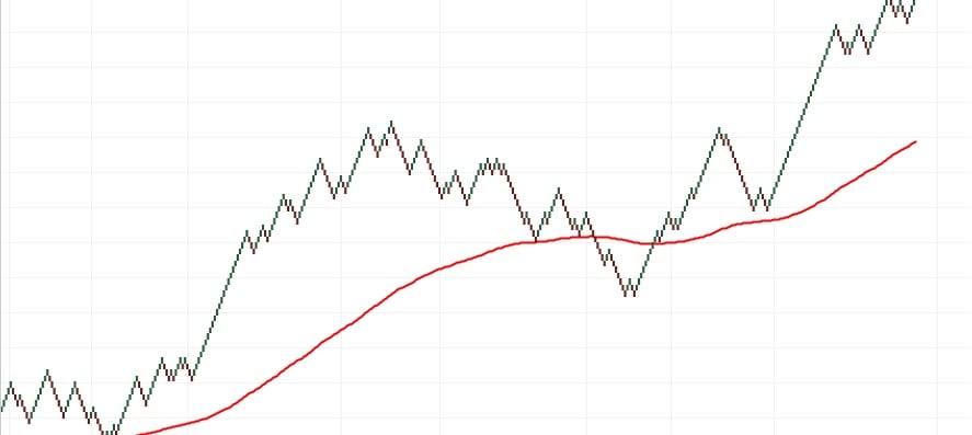
This is done by adding a 200-day moving average to identify the trend direction. If price trades above the 200-day moving average on a closing basis, the trend is considered up; if price trades below the 200-day moving average, the trend is considered down.
How to Download the Renko Indicator

Downloading the Renko indicator is not complicated. All you need to do is open the MetaTrader 4 platform, go to Navigator, choose Indicators, select the Renko indicator template, and load it as shown in the images.
Technical Analysis Patterns on Renko Charts
Renko reduces minor price movements and filters out small fluctuations, which makes it easier to read distinct price patterns and support/resistance levels more clearly, along with price patterns based on standard technical-analysis rules.
In the end, keep in mind that the Renko chart is a different kind of chart from the ones already out there, with its own strengths and weaknesses. Once you start using a Renko chart, mapping out the trend and support/resistance levels becomes much easier. That said, after trying it, you might still find yourself drawn back to traditional candlestick charts, and that is not unusual either. There is a huge range of analysis tools out there, and what matters is that each forex trader works out which ones suit them best to get the most out of them.
Summary:
Looking at how the Renko chart works, its charts are built to filter out minor price moves so traders can focus on the trends that matter. That makes trends easier to spot, but the downside is that some price information gets lost because of how simplified Renko charts are.
The first step is choosing a box size that represents the amount of price movement — for example, an asset might use a $0.25 box, or a currency pair might use a 50-pip box. A Renko chart is then built by adding a new brick in the next column once price moves beyond the top or bottom of the previous brick by that box size.
Renko bricks form at 45-degree angles to each other, and consecutive bricks are never placed side by side. Here are the key points about the Renko indicator:
- Bricks can be any price size, such as $0.10, $0.50, or $5 — this is called the box size, and it can also be based on the Average True Range (ATR).
- Renko charts do have a time axis, but the time frame is not fixed. Some bricks take longer to form than others, depending on how long price takes to move the required box size.
- Renko charts filter out price noise and help traders read the trend more clearly by filtering out the smaller moves within the swings.
- Renko is usually used to track only closing prices based on the chart’s selected time frame — on a weekly time frame, for example, weekly closing prices are used to build the bricks.
Read more:
What is slippage and how to avoid it?
Test this indicator without risking capital
Reading about an indicator is not the same as watching it behave on a live chart. A demo account lets you apply the settings above to real market data and see how the signals form before any money is involved.
Advertising disclosure: partner link. Easy Trade may receive compensation. Educational content, not financial advice. CFDs carry a high risk of losing your capital.
Disclaimer: This article is for educational purposes only and is not investment advice. Renko charts and other technical-analysis tools are neutral indicators — they highlight potential patterns but cannot guarantee outcomes, and any trading signal can fail. CFD and leveraged trading carries a high level of risk and may not be suitable for everyone; you can lose more than your initial deposit. Some links on easytradeweb.com are affiliate links, meaning we may earn a commission if you sign up through them, at no extra cost to you.