
The Beveridge Curve: Reading Vacancies Against Unemployment

The Beveridge curve is a single scatterplot with two labour figures on it, and almost everything written about it is written for a policymaker. That leaves a gap for anyone who watches the releases that feed it. The two numbers arrive in separate reports, on separate days, measured over different stretches of time, and nobody plotting the point live is told that.
What follows is how the curve is built, which release supplies each axis, what a sideways shift in the curve changes about the same fall in vacancies, and where the reading stops being useful.
Key takeaways
- The curve plots a vacancy rate against an unemployment rate. Both axes are rates, not counts, and the two rates do not share a denominator.
- In the United States the two numbers come from two different surveys published on two different days, so a point on the curve is never assembled from one release.
- Moving along the curve and the curve itself moving are two different events with two different causes. Eurostat attributes the first to labour market tightness and the second to matching efficiency.
- An outward shift means a deterioration in matching. The Richmond Fed observes that a completed cycle usually leaves the whole cloud sitting somewhere other than its starting position.
- The European Union draws the same curve on quarterly data, so the euro-area version gains four points a year against twelve for the American one.
Table of contents
- What the Curve Plots, and Why the Axes Are Not the Ones You Expect
- The Two Numbers Come From Two Different Releases
- Moving Along the Curve Is Not the Curve Moving
- The V/U Ratio Is the Part That Reaches a Trading Screen
- Why an Outward Shift Makes the Same Fall in Vacancies Cost More
- Reading It on the Morning JOLTS Prints
- Europe Draws the Same Curve on a Quarterly Series
- What This Curve Cannot Tell You
- Frequently Asked Questions
What the Curve Plots, and Why the Axes Are Not the Ones You Expect
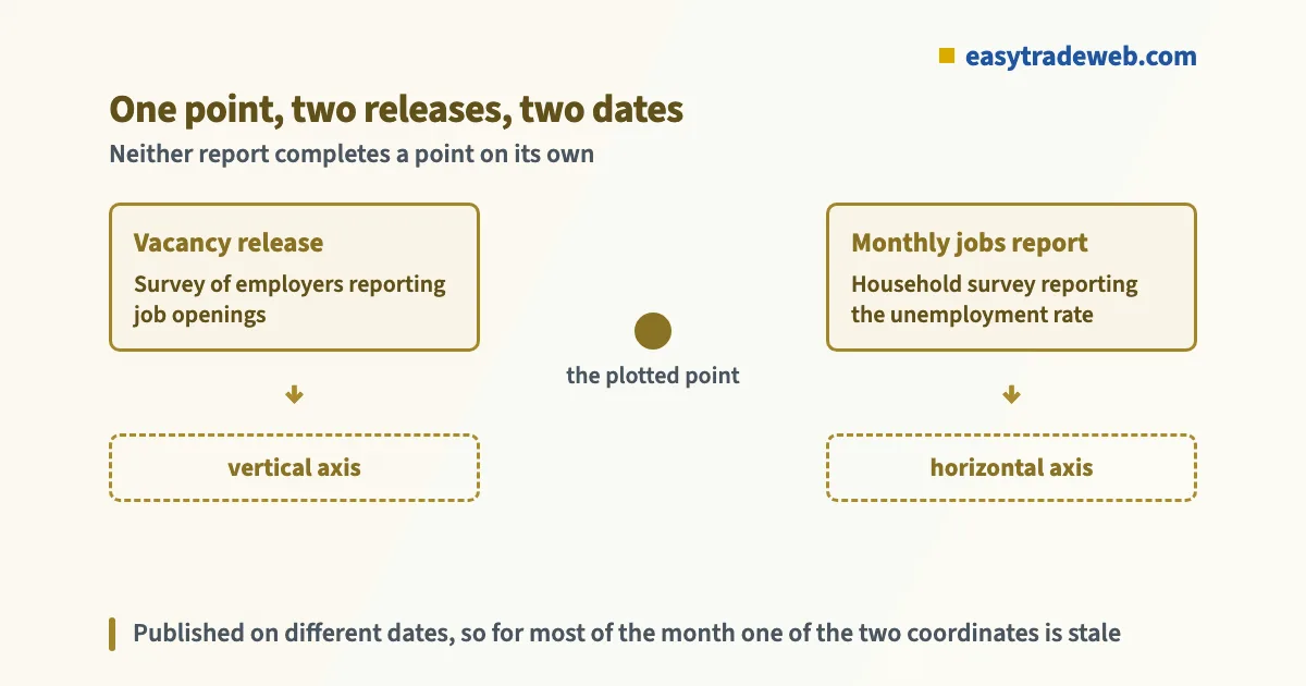
The curve carries the unemployment rate on the horizontal axis and the job vacancy rate on the vertical one. Each dot is one period. Join the dots and the cloud slopes downward: periods with many unfilled positions are periods with few people out of work.
The first thing that trips readers is that both axes are rates, and the two rates are not built the same way. The unemployment rate is unemployed people as a share of the labour force. The vacancy rate is unfilled positions as a share of all posts, filled and unfilled together. So the denominator on one axis counts people looking for work and the denominator on the other counts jobs. They are not two views of one population.
The second is that a vacancy rate is not a vacancy count. A headline that says openings fell by some number is describing the numerator alone. If employment fell at the same time, the rate can hold still while the count drops. The curve moves on the rate, which is why a release that reads badly in the headline sometimes leaves the dot roughly where it was.
Named after the British economist William Beveridge, the relationship has been drawn for decades and by statistical agencies on both sides of the Atlantic. What has changed is not the shape but how much weight is placed on where the whole cloud sits.
The Two Numbers Come From Two Different Releases
This is the part that no chart page states, and it is the part that matters if you want to know what has just happened to the dot. In the United States the vacancy rate comes out of the JOLTS report, a survey of employers. The unemployment rate comes out of the household survey published in the monthly employment report alongside non-farm payrolls. Two surveys, two samples, two publication dates.
The payrolls report lands first and the vacancy figure follows weeks later. For most of any given month, then, only one of the two coordinates has been updated. A commentator describing where the curve sits on payrolls day is describing a dot whose vertical position is still the previous reading.
The reference periods do not line up either. The two surveys ask about different windows inside the month, so even a completed dot pairs measurements that were not taken at the same moment. That is fine for a decades-long scatterplot and awkward for anyone treating a single new dot as news.
The practical consequence is a scheduling one. If the curve is part of how you read the labour market, the release that changes it is the vacancy release, not the jobs report, and the two sit in different weeks on the economic calendar. The intermediate estimate published by the ADP employment report touches neither axis.
Moving Along the Curve Is Not the Curve Moving
Two things can happen to a dot, and they mean opposite things. Eurostat separates them cleanly: movement along the curve reflects a change in labour market tightness, while a shift of the whole curve reflects a change in matching efficiency, meaning how easily an unemployed worker finds a job at any given vacancy rate.
Along the curve is the ordinary business cycle. An expansion pushes the dot up and to the left, towards many vacancies and low unemployment, with upward pressure on wages. A contraction drags it down and to the right. Nothing structural has happened; demand has changed.
A shift is different. An inward shift means matching has improved, and an outward shift means it has worsened. Eurostat lists changes in the skills and qualifications employers ask for among the causes, along with growth that runs unevenly across regions or industries.
The Richmond Fed makes the awkward observation about these shifts. A cycle rarely finishes with the cloud back in the position it began from, and the displacement is larger after longer and deeper recessions or expansions. Any single dot is therefore a mixture of a cyclical position and a structural one, and reading it as purely cyclical is the standard error.
The V/U Ratio Is the Part That Reaches a Trading Screen
Traders rarely look at the scatterplot. What circulates is one number derived from it: vacancies divided by unemployment, usually written as the V/U ratio. It compresses the position of the dot into a single figure and is quoted as a measure of how tight the labour market is.
Above one, there are more unfilled positions than people counted as unemployed. Below one, the reverse. The ratio rises either because vacancies rise or because unemployment falls, and the two routes carry different implications for wages, which is information the ratio throws away.
It also hides the shift. A ratio can be read off a curve that has moved outward and a curve that has not, and the number looks the same in both cases. That is the cost of the compression, and it is why the scatterplot survives alongside the ratio rather than being replaced by it.

Why an Outward Shift Makes the Same Fall in Vacancies Cost More
Here is the argument that put this curve into central bank speeches. If a central bank wants to cool wage pressure, it wants vacancies to fall. The question is what happens to unemployment while they do.
Read off a steep section of the curve, vacancies can fall a long way with only a small rise in unemployment: the economy simply moves back down a slope it climbed. Read off a flatter section, or off a curve that has shifted outward, the same fall in vacancies is paid for with a much larger rise in unemployment. The geometry, not the policy, decides which.
This is a live disagreement rather than a settled reading. In a FEDS Note published in July 2022, Andrew Figura and Christopher Waller set out a framework built on labour market flows. In it the unemployment rate settles at a level fixed by two rates: how fast people leave jobs, and how fast they find them, with hires produced by a matching function of vacancies and job seekers.
They used that framework to answer a policy brief by Blanchard, Domash and Summers, which had concluded that the prospects of a soft landing were essentially zero. Their own reading was that a soft landing remained a plausible outcome.
Two sets of economists, one curve, opposite conclusions. For a reader, the useful takeaway is not who was right. It is that the same dot supports both readings depending on assumptions about the curve underneath it, so a confident forecast drawn from a Beveridge chart is carrying assumptions it is not showing you.
Reading It on the Morning JOLTS Prints
The curve is a slow object and a vacancy release is a fast event, so most of what it offers on the day is context rather than signal. Three questions make that context usable.
First, did the vacancy rate move, or only the vacancy count? If employment moved with it, the dot may not have travelled at all. Second, in which direction did it travel relative to the last few dots? A single point continuing a run tells you less than a point that breaks one. Third, is the unemployment coordinate current or stale? Between the jobs report and the vacancy report, one of the two is always older than the other.
What the curve adds to a release is a sense of the price of further cooling. A dot high on a steep section says vacancies have room to fall without much unemployment following. A dot on a flat section says the next stage of cooling arrives through unemployment instead, which is the reading that changes rate expectations and therefore currency pricing.
None of that is a trading rule and it should not be turned into one. It is a way of deciding whether a vacancy print is consistent with the policy path already priced, which is the same question the wider stagflation debate turns on when growth and inflation pull in opposite directions.
Europe Draws the Same Curve on a Quarterly Series
The European Union publishes its own version, and the difference is the clock. Eurostat builds the analysis on quarterly data for unemployment, vacancies and occupied posts, drawn from job vacancy statistics compiled by the national statistical authorities and returned to Eurostat.
Quarterly data means four new points a year against twelve for the American series. A euro-area curve therefore responds to a turn in the labour market roughly a quarter late, and a single European dot carries three months of change inside it rather than one.
| What differs | United States | European Union |
|---|---|---|
| Vacancy series | Employer survey of job openings | Job vacancy statistics from national authorities |
| Unemployment series | Household survey in the monthly jobs report | Quarterly labour force survey |
| Frequency of the underlying data | Monthly | Quarterly |
| New points added per year | Twelve | Four |
| Coordinates completed by | Two releases on different dates | Two quarterly collections |
What This Curve Cannot Tell You
It cannot date a shift while the shift is happening. Whether the cloud has moved is a judgement made over several quarters, and the Richmond Fed builds a statistical estimate precisely because the eye cannot separate the cyclical part from the structural part on the raw scatterplot.
It says nothing about wages directly, nothing about which industries the vacancies sit in, and nothing about the quality of a match once it is made. And it is silent on timing: a curve can sit in an uncomfortable position for years without resolving.
Frequently Asked Questions
What does the Beveridge curve show?
It shows the negative relationship between the unemployment rate and the job vacancy rate. Periods with many unfilled positions tend to be periods with few people out of work, and plotting the two against each other over time produces a downward sloping cloud of points.
Which reports supply the two numbers on the Beveridge curve?
In the United States the vacancy rate comes from the survey of employers that reports job openings, and the unemployment rate comes from the household survey inside the monthly employment report. They are separate releases on separate dates, so a single point is never completed by one report.
What does it mean when the Beveridge curve shifts outward?
Eurostat describes an outward shift as a deterioration in matching efficiency, meaning it has become harder for an unemployed worker to find a job at any given vacancy rate. An inward shift means the opposite. A shift is a different event from a movement along the curve, which reflects labour market tightness instead.
Is a high vacancy to unemployment ratio good for a currency?
No such rule holds. A high ratio is read as a tight labour market, which can raise expectations for policy rates, but currency pricing depends on what was already expected rather than on the level itself. The ratio also cannot distinguish a curve that has shifted from one that has not, so the same figure can carry different meanings.
The vacancy release that supplies the vertical axis has its own timing quirks, and reading this curve is easier once those are familiar; the JOLTS report page sets out the schedule and the revision cycle in full. From there, the household survey behind the horizontal axis is the next piece of the same picture.
Risk warning: this page is educational and explains how one economic relationship is measured and published. It is not advice to buy or sell any instrument, it recommends no product, platform or broker, and nothing here is a signal, a performance claim or a prediction. Leveraged trading carries a high risk of losing money rapidly.