
How to Read Price Action on Candle Charts

Analyzing price action on candlestick charts is more than opening a chart and hunting for an entry signal. In fact, a good price action trader knows how to set up and read charts well enough that they may not even need a specific pattern or signal to enter a trade. The market’s basic bias — set by market structure, meaning the trend and the key support and resistance levels — can often give enough information to spot a possible entry on its own. Learning to identify these pieces of technical analysis and put the puzzle together matters a great deal.

In today’s lesson I’ll walk through the basics of how to read the daily and weekly charts used in the analysis published on this site. The core pieces of this puzzle are: clean, black-and-white price charts, the key levels that make up support and resistance, trends, price action, and market bias and signals. As a result, these are the things I focus on most when analyzing and commenting on the forex market, because learning to map the market properly is essential to trading correctly with price action.
Why I Use Clean Charts and How I Set Them Up
Clean charts — charts free of indicators — are the backbone of my technical analysis and price action approach. If you’re not sure yet why bare, indicator-free price charts are preferable, a dedicated article and course on this site cover the reasoning in more depth. Put simply, this comes down to a simple trading philosophy, for reasons worth repeating often.
If you’re not using clean, indicator-free price charts yet, there’s a step-by-step tutorial on how to set up your charts that’s worth checking. You can also download the MetaTrader trading platform used here.
Here’s a Simple Way to Set Up Your Charts Correctly
Start by right-clicking on the chart, then choose Properties from the bottom of the pop-up menu. Once you do that you’ll see the chart-options screen. First, set the colors and other display options as shown in this image:
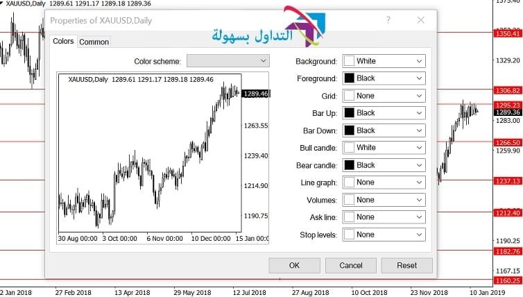
Next, open the General tab and set the options as follows:

That covers the basics of quickly setting up Japanese candlestick charts. There’s a reason for keeping this simple — simplicity works better in trading, and the goal is to eliminate variables that could cause confusion, doubt, or hesitation.
How I Analyze Clean Price Action Charts
When analyzing market charts, the first step is zooming out on the weekly chart, to get a top-down, big-picture view. This gives a clear sense of what has happened and how it might currently be affecting price.
In the chart below, notice the zoomed-out weekly view of the gold chart. The clearest key support and resistance levels are marked — notice these levels often flip from support to resistance or vice versa as price moves up or down:
In the image below, the view is zoomed out further to show roughly a full year of price data on the daily chart. This gives plenty of room to see how market levels and trends looked over the past year, along with the price action that led to the current point. The chart below shows the levels considered most important, along with consolidation zones and price swings — these are the first things to look for when analyzing price on a chart…
In the Next Chart, Zoomed In a Bit More
First, notice the up-swinging bar on the far left of the chart — this was clearly an important turning point from the downside to the upside. A horizontal level is drawn at the low of that bar; this level matters again if price drops back to it. After that, price entered a roughly two-month sideways consolidation before breaking out. However, after the breakout, price rose slightly higher and then formed a bearish pin bar around the 1237.00 area, at the resistance level marked earlier on the chart. While this would normally be treated as a counter-trend setup — not usually a favored setup — it sat at an already significant level on the chart, with a clear target below at the previous breakout level around the 1212.00 area. A short-term trade targeting a move down to that level was worth considering.
Note: the 1212.00, or 1215.00–1205.00 area, was a very strong support zone because of the earlier breakout, and the plan was to look for an entry in that zone after the bullish breakout.

In the next chart, notice how the market swings once it pulls back from a level, and how those pullback levels are then watched for trades aligned with the current momentum.
Notice the areas marked as pullback watch zones. Price was watched for a pullback to these levels after it broke above them, in order to trade in line with the bullish momentum that was clearly developing. Ideally, a price action signal forms at these levels once price pulls back to them, but as noted elsewhere, that isn’t always necessary — sometimes a level and a direction are enough to justify an entry.
Conclusion
Market analysis works best top-down: start with the longest timeframe, zoom out, then gradually shorten the timeframe while moving closer in. This gives a “bird’s-eye view” of the market, so that recent price action makes more sense in the context of the bigger picture. Think of daily market analysis like reading a book — to understand what happens on page 100, pages 1 through 99 need to be read and understood first. Trading works the same way: build a picture of the market being analyzed by looking back in time, mapping levels, analyzing price action, then keeping up with the market each day at the close, adjusting levels, or factoring in news when needed.
Once this becomes a regular habit, it turns into a price action trading routine, and eventually just becomes routine. Staying on top of the markets day to day is genuinely engaging work. What it really comes down to is aligning with the market and its price action, which is necessary for anyone who wants a real shot at trading professionally.
Price action can be read and interpreted through charts that plot prices over time, and traders use different chart types to sharpen their ability to identify and interpret trends, breakouts, and reversals. Many traders use candlestick charts because they help visualize price action more clearly, by showing the open, high, low, and close values within a defined up or down context.
FAQ
What is a sideways trend?
A sideways trend is when price moves within a narrow range, between defined levels.
What are the types of technical analysis?
- Classical technical analysis: analyzes official price and volume data, using charts and technical indicators.
- Quantitative technical analysis: uses mathematical and statistical models to analyze prices and past price moves, relying on software and data-analysis tools.
- Pattern-based technical analysis: studies past trends and patterns in price and is used to estimate possible future price direction.
How is a currency’s price forecast?
Forecasting a currency’s price depends on a mix of economic and political factors. Generally, this involves following news and economic and political reports tied to the country issuing the currency, alongside technical factors and charts for the currency and related markets. Analytical tools such as technical indicators, algorithms, and mathematical models are used to analyze prices and estimate possible future trends.
How do you identify price direction?
Price direction is identified by analyzing price charts with technical indicators. Moving averages, the Relative Strength Index (RSI), a linear regression indicator, the MACD indicator, and other indicators are commonly used.
Test this indicator without risking capital
Reading about an indicator is not the same as watching it behave on a live chart. A demo account lets you apply the settings above to real market data and see how the signals form before any money is involved.
Advertising disclosure: partner link. Easy Trade may receive compensation. Educational content, not financial advice. CFDs carry a high risk of losing your capital.
Disclaimer: This article is for educational purposes only and does not constitute investment advice. Trading forex and CFDs on margin carries a high level of risk and may not be suitable for all investors; leveraged products can result in losses that exceed your initial deposit, and past chart behavior does not guarantee future results. This page may contain affiliate links, meaning we may earn a commission if you sign up through them, at no extra cost to you.